Roots
One name. A shared foundation.
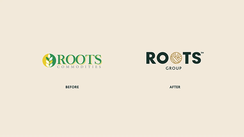
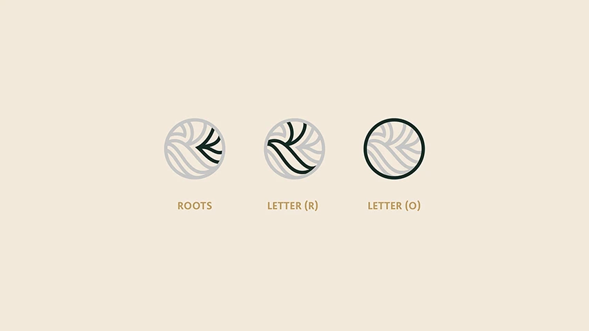
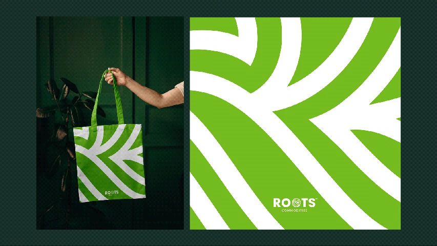
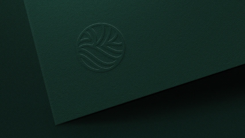
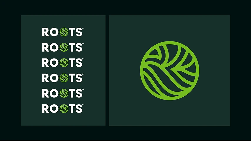
Bringing Roots’ different business names together required a shared group identity. BRANDIZER developed a circular emblem that combines root shapes with the letters R and O, then carried it into the group name and its related brands. Green tones and branching lines connect the mark with the name’s meaning.
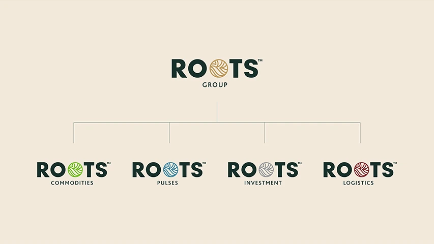
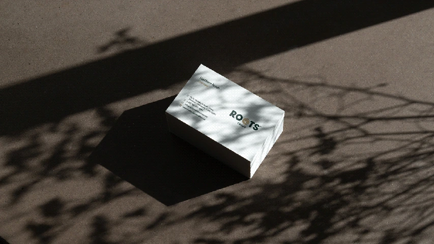
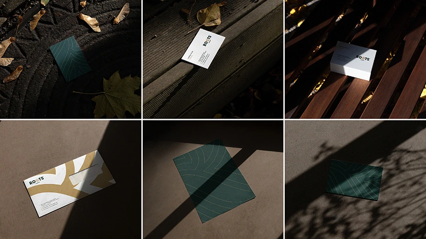
The identity links the parent brand with the different businesses while distinguishing their names. Repeated forms carry that relationship into stationery and other brand materials, so the group can communicate as a whole while each business keeps its place.
Capabilities used
Brand uplift
Rebranding