Sea Gull
Separate the varieties, keep the signature.
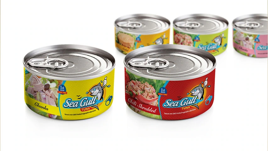
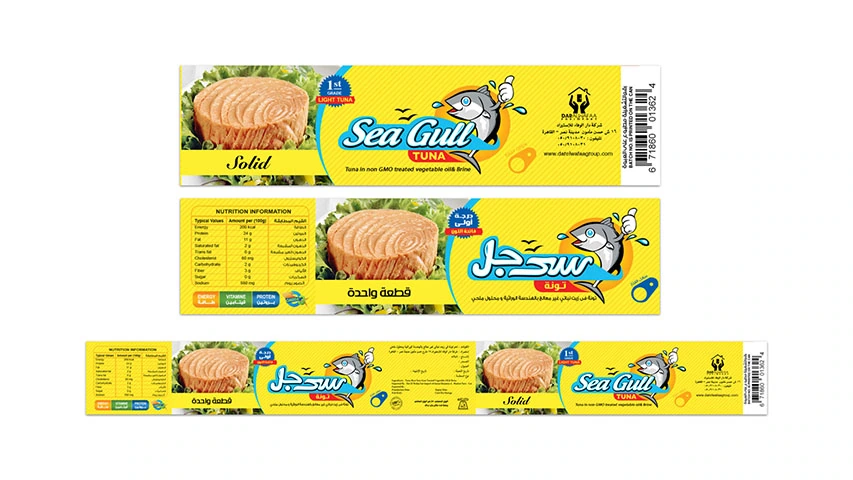
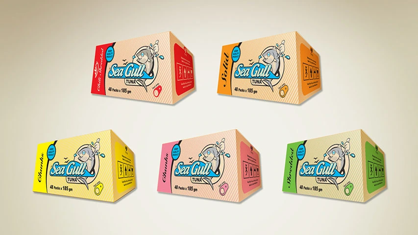
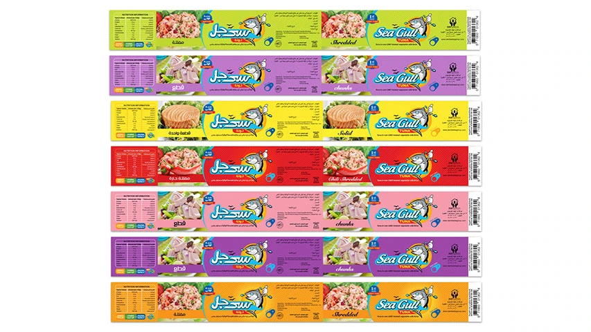
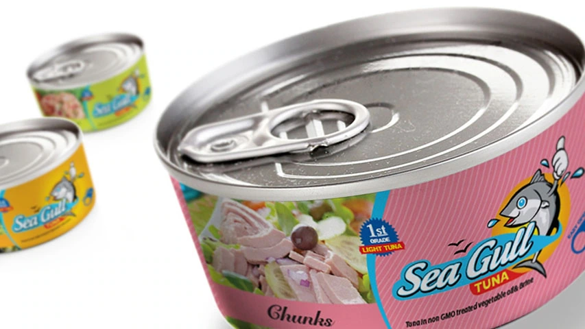
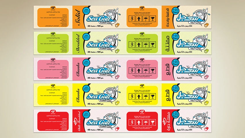
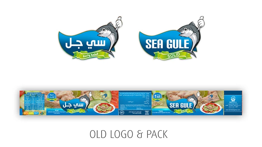
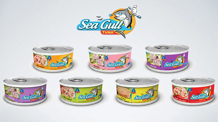
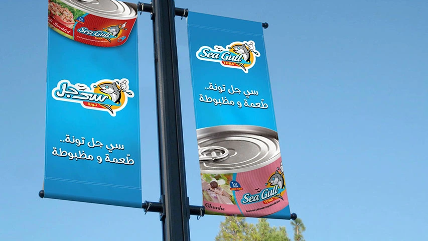
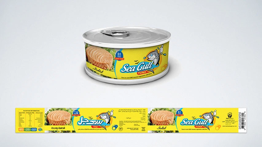
A tuna range with several cuts and flavours needed Sea Gull’s packaging to separate varieties without losing its identity. BRANDIZER redesigned the illustrated fish mark and bilingual lettering, designed the packaging and produced the labels, cartons and banners. Colours distinguish the products across the range.
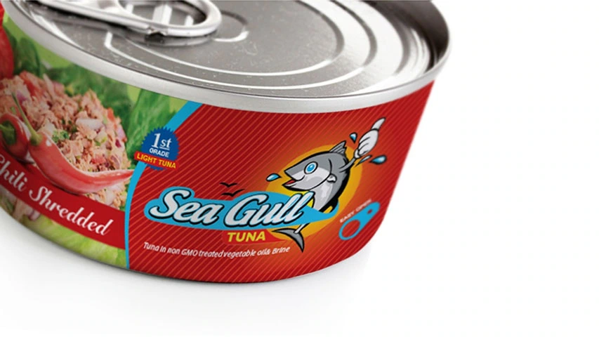
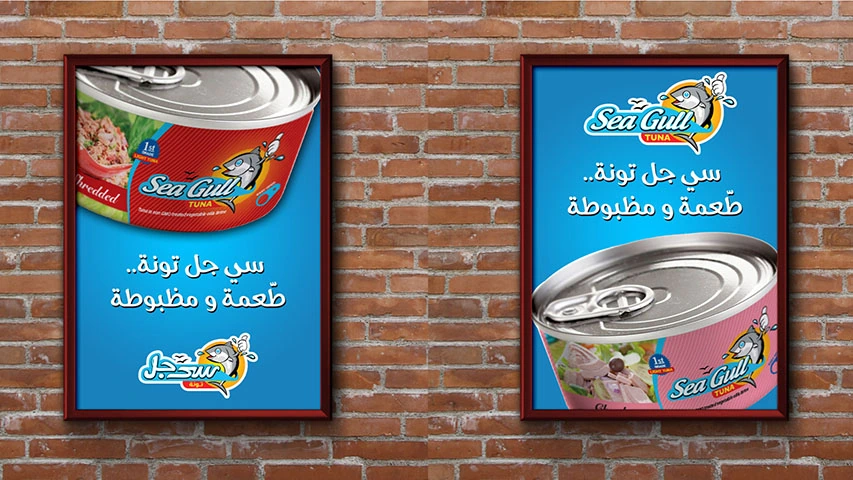
The fish character and name stay prominent as label colours and serving images change. Product information has its own space beside the signature. We extended the same elements into the outer cartons and advertising, connecting individual cans with the wider range and its brand.
Capabilities used